
Band design for ABR
As my final work as a student I created a corporate identity for the band
August Burns Red to support them with my designs.
T-shirt motifs which match the messages of the band (their lyrics, history, fans and the music culture).
■■■
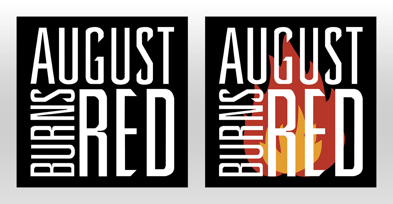
Logo design
Logo design
My basic idea here was to reshape the old logo. Make it cubic, so it fits on any t-shirt as a patch. Simple black-and-white makes it an eyecatcher and leaves the possibility to play with the background.
■■■
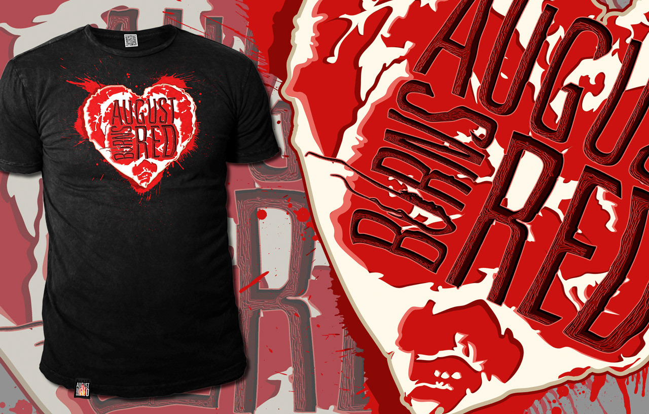
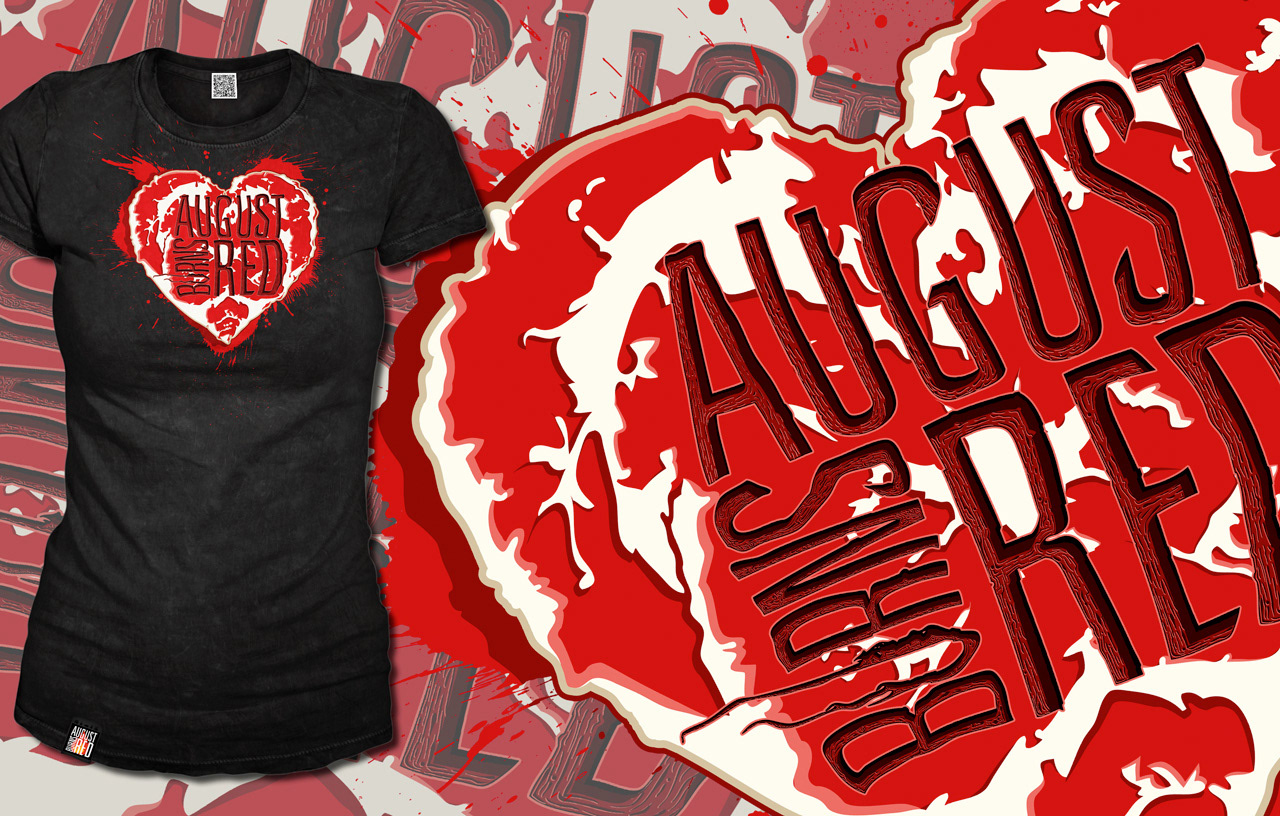
Branded Heart
Branded Heart
A piece of raw flesh, shaped as a heart in which the band logo has been burned in is intended to remind viewers of the well known 'I ♥ motif'.
The raw flesh represents the unspoilt purity and natural connection - the love to the band and the music it represents is unquestionable and therefore permanently branded in. The fans are part of the music and the shirt and logo part of the fans.
The music scene and AUGUST BURNS RED is more than just the music - the symbiosis is complete.
■■■
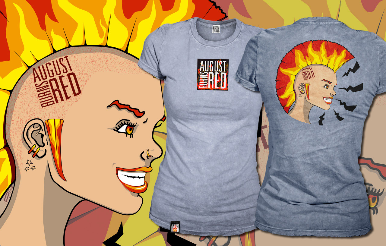
August
August
The bad ass punk girl.
The origins of the band and the beginnings of the music Metalcore which was seeded by Punk is combined in one motif.
Only available for badass girls!
Only available for badass girls!
■■■
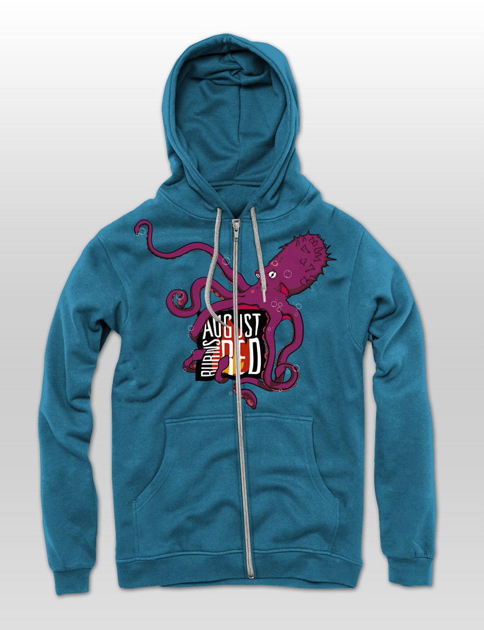
Octupus
The octopus is a sea monster from the depths of the ocean and stands here for the consumer society which is pulling us into the depths.
The fight with the octopus stands for each and everyone's daily fights with their own ideals threatened of being dragged under into the swamp of a shallow and corrupt society. 'We are going under!' is ABR singing in their song 'Marianas Trench'. Will the octopus besiege you with his all consuming tentacles?

■■■
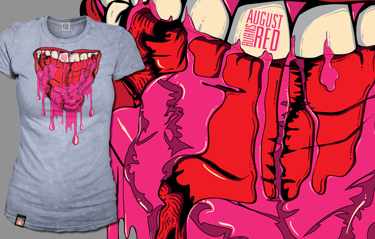
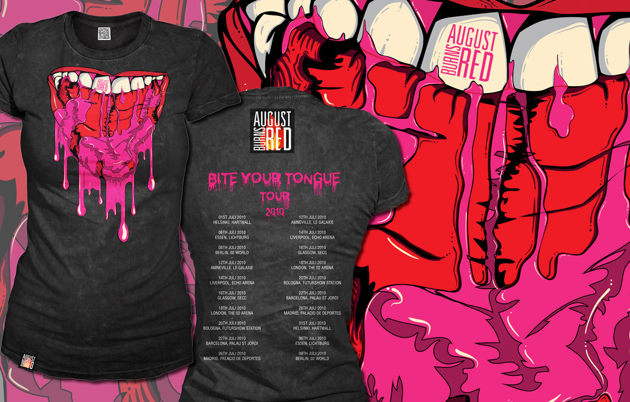
Bite your tongueA complex motif with an important message.
On first sight, it is provocative and brutal.
It shouts out to all, who had 'better bite their tongue till it bleeds' rather than spew ignorance.
A message worth broadcasting on your chest.
■■■
Other possibilities to use the artwork